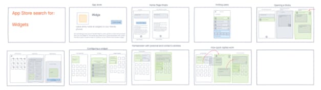
.jpg?width=300&name=one-week%20design%20sprint%20meeting%20(1).jpg)
iOS 14 recently dropped with a long-overdue feature that Android users have had for years - the Widget. Widgets are tiles that stick to your homescreen so you can access information like weather, calendar, news, or stocks at a glance. They’re customizable and configurable and, because they’re new (on iOS), they offer new ways for people to connect and communicate.
Being the students of innovation that we are, we decided to spend a week coming up with the coolest widget idea we could think of.
There are many arrows in the innovation quiver, but for this challenge, we chose the one-week design sprint - a five-day process used by hundreds of companies to solve tough problems in one week. If you haven’t tried doing a design sprint, we recommend getting the book, grabbing a few colleagues, clearing your calendar and JUST DO-ing IT. If you need help, guidance, or a couple of partners who love a tough innovation challenge, hit us up at sprint@sfappworks.com.

Before you start a one-week design sprint
To do a One-Week Design Sprint, you need a couple of things. First, you need a problem to solve. Most features are designed to solve a specific problem - get user to do x, y, or z. Design Sprints provide a framework to solve sticky, complex problems in situations where the stakes are high. Blue Bottle Coffee used one to come up with the layout for their first online store, Slack used one to figure out the best way to explain their value prop to new businesses, and we did one to create a unique and interesting widget.
Second, you need a few people who really understand the problem and the variables. This usually comes down to someone who has the authority to make big decisions in the company (the Decider), someone who can make your idea look good (usually a designer), someone who talks to customers (can be a sales or customer support person), someone technical (a developer or maker), and a good writer (usually a marketer). You can fill out your team with a few other stakeholders, but cap it at seven and invite any additional experts to provide context interviews on day one.
Third, you need some space and some tools. In a perfect world, the design sprint happens in person, on a whiteboard, without distraction and with plenty of snacks and breaks. But we’re in the middle of a pandemic, so our sprint team was distributed.
Instead of whiteboards, we used Freehand by InDesign.
Instead of meeting at the same time, we identified overlapping hours and scheduled jam sessions.
Instead of being in the same room, we turned on cameras for group discussions, then left them on while we went about our tasks.
It wasn’t perfect, but it worked.
Finally, you need buy-in from your colleagues, which starts by explaining how design sprints work. Just tell them you’ve got a really interesting idea about how to conceptualize, design, prototype, and test an idea in one week. Tell them it is the safest and most surefire way to validate a BIG idea without spending months or years on it. Tell them you’re either going to discover something big, or rule out a lot of nonviable ideas very quickly. Or just send them this article.
Related: Top Software Development Companies in USA | SF AppWorks
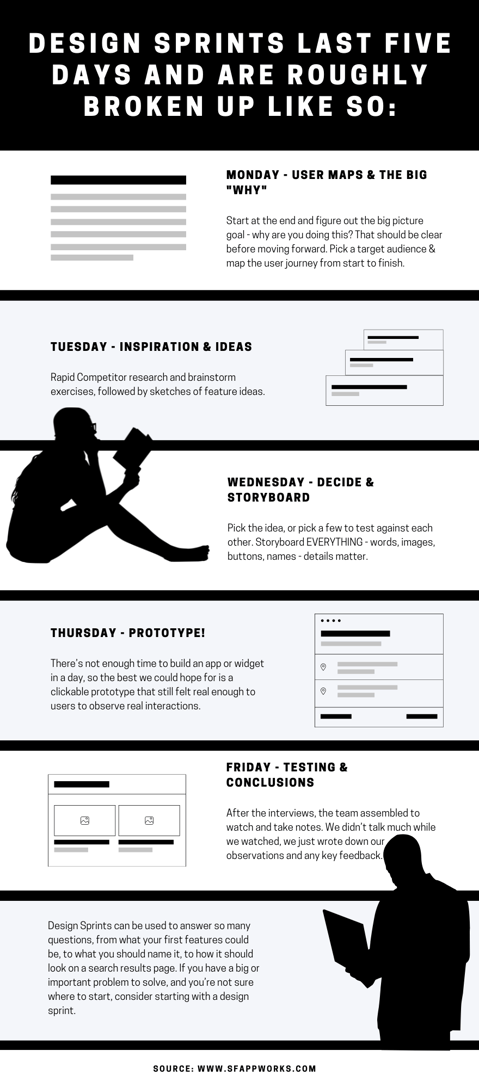
Design sprints last five days and are roughly broken up like so:
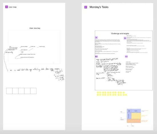
Monday - Start at the end and figure out the big picture goal - why are you doing this? That should be clear before moving forward. Pick a target audience and map the user journey from start to finish.
Tuesday - Rapid Competitor research and brainstorm exercises, followed by sketches of feature ideas.
Wednesday - Pick the idea, or pick a few to test against each other. Storyboard EVERYTHING - words, images, buttons, names - details matter.
Thursday - Build your testable prototype.
Friday - Test. Learn. Draw conclusions.
Related: InsideSource Design Sprint
Design Sprint | Monday - User Maps and the big “WHY”
I have a confession to make. When we started on Monday, we thought we already had our idea in mind. We’ve been really into micro-habits and even built a PushUp app to help people get fit by doing just one pushup per hour. We thought the natural use case for micro-habits and reminders was a micro-reminder app. The problem - we couldn’t figure out WHY we were building that. At first, we said we wanted to use it, but none of us could figure out how a widget was an easier way to set a reminder than simply saying “hey siri, remind me to drink water every hour”. We had a solution without a problem, and no answer to the most important question.
Our why is actually quite simple. We are an innovation agency. The reason we build cool apps and prototype the newest technology is so we can sell our innovation services. Sure, we also do it because we love innovation and technology, but that’s why we work at SF AppWorks. The only way to sell innovation by building a cool widget is to use a cool innovation process, come up with a cool result, and talk about the process and result so that people like you (aka people who think like us) can read it and, hopefully, become curious about working together.
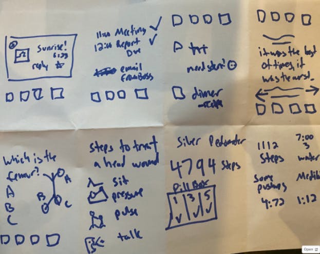
Having determined our WHY, we could now move onto the target user, which in this case is people who have iOS 14 installed and/or have experience using widgets. We had many more questions, which we wrote down on a whiteboard. By the end of the day, we were able to sketch out our first user map. The whole thing looked like this:
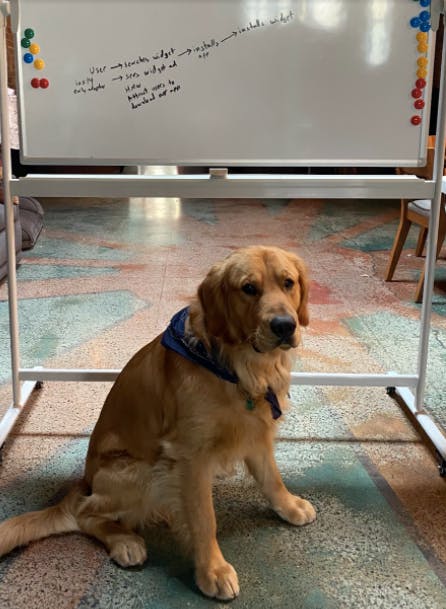
Make the user flow so simple a dog would get it
Design Sprint | Tuesday - Inspiration and Ideas
By now we had defined our challenge and picked our target user. We had a shared board with all of our questions listed, alongside our short and long term goals. Our stickiest questions, like “How can we get users to install this widget?”, were listed on the user map next to the corresponding point in the user flow. It was time to find some inspiration.
Related: What is Rapid Prototyping
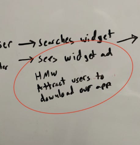
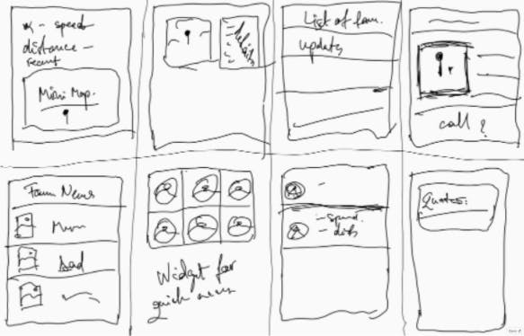
Board shows “How Might We attract users to download our app at the “Sees Widget Ad” step.
We each spent a few hours studying the existing market for widgets. We looked at android widgets, which have been around for years, and we looked at things like widgets - billboards, tickers, sticky notes. Then we regrouped for lightning demos - quick three minute presentations of the best ideas we had come across.

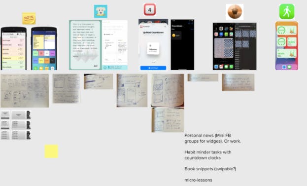
Screenshots presented to the team during the lightning demos.
After doing lightning demos, we took some time to absorb the research and brainstorm ideas independently. We needed to gear up for a creative exercise called Crazy 8s.
One-week design sprint: Crazy 8s
If you want to uncork creativity, give yourself a tight timeline and a lot to do. Crazy 8s is a timed exercise that requires you to come up with 8 variations of a single idea...and you only get one minute per variation. There’s no time to think and no time to dwell - you just go and when the timer dings, you move on to the next one.
It can be 8 variations of the same idea, or it can be a few variations of a few different ideas. Sometimes, you uncover something totally interesting and unique. Other times, you realize your initial concept was the best. But something about seeing what these concepts look like on paper adds a realness to the ideas, for better or worse.
Related: Mastering The Brainstorm
Variations of Crazy 8s
One-week design sprint: Solution Sketch
It was time to move from concept exploration to solutions. For this part, the team split up and worked on their own. Now that we had shared our lightning demos and sketch variations, we had a lot of ideas to work with. We each picked our favorite one and drew a three-panel storyboard. The storyboard had to be self explanatory - meaning that anybody could look at the three panels and understand, at a high level, what journey the user would take from start to finish. That required the sketches to be accurate - no scribbly lines for text, no skipping steps in the flow. And it had to have a catchy title.
Take a look at this solution sketch, which we didn’t end up using, and see if you can understand what it does without asking questions.
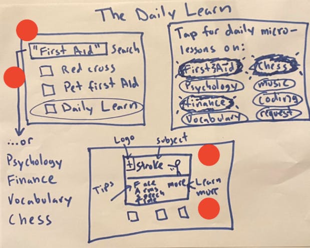
If you answered “A learning widget that provides a daily lesson on any number of topics that are interesting to you, topics such as first aid, psychology, or chess.” Then you are correct! If not, then our solution sketch was not accurate enough.
Having spent our creative juices and equipped with a small stack of solutions, we wrapped for the day.
Design Sprint | Wednesday - Decide and Storyboard
It was time to decide. The Design Sprint pushes you at an uncomfortable pace, but because you move quickly, nobody gets too attached to their ideas. This makes it easier to settle on one, with the help of a few decision making techniques.
We put our sketches onto our digital whiteboard for everyone to see. Each person got a stockpile of dots to place next to interesting features or things they liked, effectively turning our board into a Heat Map. This visual representation of interest enabled us to pull ideas from across the board and remix them into the chosen solution.
Once the dots were placed, we gathered round for speed critiques of each sketch. As a group, we discussed the highlights and captured standout ideas and important objections.
If you can’t decide together on your favorite concept, you can settle it with a Straw Poll. Each person places a large dot next to their favorite idea. The decider reviews the votes and casts the final decision. Now you have a candidate to prototype.
Once we selected our favorite idea and pulled some features/concepts from the other sketches, we got down to storyboarding. We drew a grid, picked an opening scene of how the user would encounter our product, and filled out the storyboard.
Initial storyboard for Stiki - a social sticky note for your dashboard.
Design Sprint | Thursday - Prototype!
On the fourth day, you “fake it until you make it”. There’s not enough time to build an app or widget in a day, so the best we could hope for is a clickable prototype that still felt real enough to users to observe real interactions.
We spent a lot of time discussing how the actual test would go. We wrote a script and discussed how we could actually get the information we wanted. We had two main questions we wanted the research to answer:
- Would users download our widget if they saw it on the app store?
- If they were going to use Social Stickies, how would they use them?
- Was there enough genuine interest in the concept to validate building a real version?
Would users download our widget if they saw it on the app store?
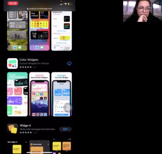
To answer the first question, we created a fake Search Results page that users could load onto their phone. We would ask them to scroll through the results and describe to us what each widget did. Then we would ask them to tell us, widget by widget, whether they would or would not install it. Since they didn’t know which one was ours, we didn’t have to worry about getting placating answers.
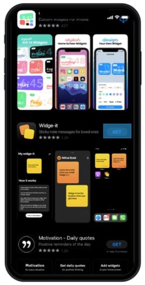
Our test widget, buried in a stack of real widgets.
If users were going to use Social Stickies, how would they use them?
To answer the second question, we walked through a series of use cases and demo screens, all the while asking non-leading questions and asking them to narrate their experiences. We would learn what features were interesting, what seemed unnecessary or redundant, and we would discover new ideas we never even considered (almost all of the users mentioned that they would want to customize their widget colors and fonts). We could watch their reactions to see if their eyes lit up, or if they seemed uninterested. We could observe whether they asked questions to understand what was going on, or if it was self-explanatory.
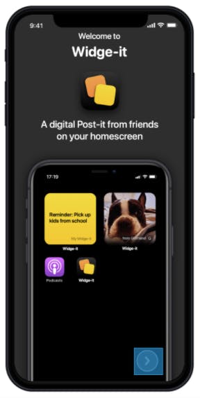
Social Sticky Widget on an iPhone screen
Was there enough genuine interest in the concept to validate building a real version?
Devising a test to answer the third question was the trickiest part. How would we gauge real, genuine interest in the product? We could ask them, but we felt the testers would tell us they were interested, even if they weren’t. We decided to include one last ‘hidden’ test. When we finished the interview, we told each tester that we would send them an Amazon Gift card as a thank you. When we sent that gift card, we included a link where they could sign up to be notified when the widget was released. If they signed up, it pointed towards real interest.
Our Latest Video on Rapid Prototyping
Watch this stop motion lego dramatization of a company that invests months, heck years into the development process without employing Rapid Prototyping to first research and determine the strengths and weaknesses of different platforms.
Design Sprint | Friday - Testing and Conclusions
Earlier in the week, when we had defined our target audience, we began recruiting testers. We devised a Screener Survey with questions like “what operating system do you have” and “how many apps have you installed in the past week”. Our goal was to find five users that we didn’t know and who had iOS 14 and/or had installed a Widget.
We posted our screener survey on Facebook, Twitter, and LinkedIn, and tried setting up an account with UserInterviews.com, though they wouldn’t let us host the interviews so they weren’t useful. We considered Craigslist, but passed since we weren’t doing in-person interviews. We offered $50 Amazon Gift Cards for their trouble and used Google Forms for the Screener Survey.
I arrived a few minutes early with my script in hand to each 30-min Zoom session. Once the interview began, I asked if I could record them, then asked them a few questions about their digital habits before diving into the tests. I had them share their screen and moved them through each test with as little guidance as possible, and with as many non-leading questions as I could muster - “what’s happening here. What do you think about this? Describe what each of these do? What do you like/dislike about this feature?
After the interviews, the team assembled to watch and take notes. We didn’t talk much while we watched, we just wrote down our observations and any key feedback. We used pluses, minuses, or colors to connote positive, negative, or neutral feedback. We organized it into three phases - the Search page, the install page, and the homescreen page. When we were done, we put all of the feedback into a matrix, then looked for patterns.
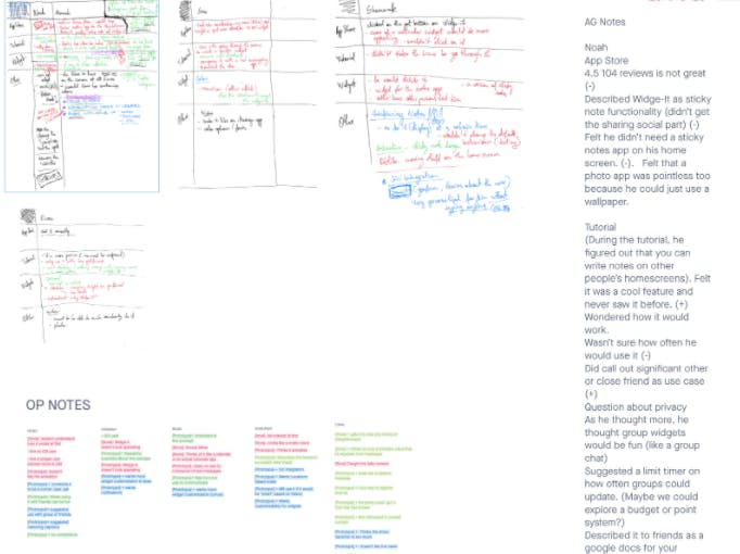
Notes from the User Interviews
We learned that customization of the widget colors and fonts was extremely important, since this was going to live on their homescreen. We learned that the value proposition was lost in the search results page - most users thought the widget was a post-it note from yourself, when it was actually designed to be a note left by others. We learned that a reminder note that you could leave yourself wasn’t interesting or unique. And we learned that the concept was endearing.
Users shared stories of how they left real sticky notes in laptop bags and around the house to surprise their loved ones with a thoughtful and well-placed message. Figuring out how to recreate that digitally would be a challenge, but at least we had a clear idea of how it needed to FEEL. We also learned that there was genuine interest in that several of the testers added their names to the beta invite.
More importantly, we learned this all in a week. It felt like a microcosm of a year of work. We had an initial idea, pivoted several times, learned about competitors, came up with our concept, put it in front of real users, and walked away with a clear set of priorities and features, should we decide to continue. And we did all without writing a single line of code.
Design Sprints can be used to answer so many questions, from what your first features could be, to what you should name it, to how it should look on a search results page. If you have a big or important problem to solve, and you’re not sure where to start, consider starting with a design sprint.
HERE'S A ONE-WEEK DESIGN SPRINT, BASED ON OUR EXPERIENCE:
.png?%20White%20Bake%20Sale%20Promotion%20Facebook%20Post%20(4).png&width=290&name=Simple%20Pink%20%26%20White%20Bake%20Sale%20Promotion%20Facebook%20Post%20(4).png?%20White%20Bake%20Sale%20Promotion%20Facebook%20Post%20(4).png)
COMMENTS